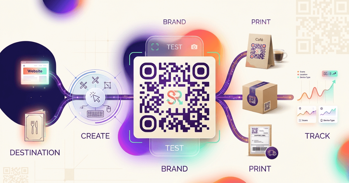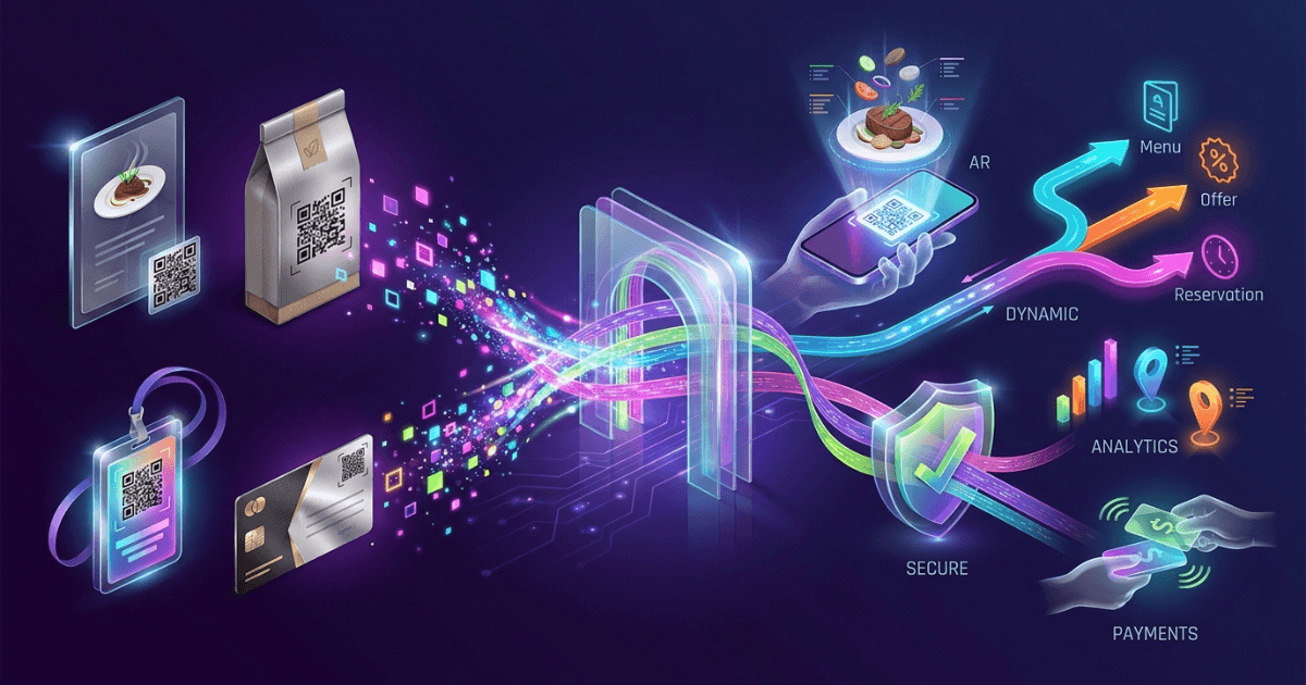
Branded QR codes design should do two jobs at once: look on brand and scan fast. The best codes make your campaign feel polished without slowing a customer down.
For marketing agencies, influencers, ecommerce teams, and cafes, that balance matters. A code that looks good but fails at the table or checkout is just wasted space.
If you want the bigger strategy first, read The Ultimate Guide to QR Codes: From Basics to Branded Solutions and compare static and dynamic setups in Static vs Dynamic QR Codes: Which Should You Choose?.
Why branding matters in QR codes
Branding turns a plain square into a trust signal. People scan faster when the code feels familiar, clean, and tied to the offer.
That is why branded QR codes design works best when the visual style matches the landing page, menu, product pack, or social campaign. Consistency lowers doubt.
It also helps analytics. When you pair a branded code with tracking, you can see which design, placement, and offer actually drives scans. Our guide on QR Code Tracking and Analytics for Measurable Success shows how to turn scans into usable data, and Shrno is built for that kind of campaign control.
Design elements that affect scanability
The scan area is unforgiving. A QR code needs clear edges, enough quiet space, and a shape that cameras can read in a split second.
Keep the code square. Avoid heavy distortion, tight cropping, and decorative shapes that break the module grid.
- Keep a clean quiet zone around the code.
- Use enough size for the viewing distance.
- Do not place text or photos inside the scan field.
- Keep rounded styling subtle, not extreme.
- Test on more than one phone and app.
Google’s QR code documentation and the ISO/IEC 18004 standard both reinforce the same idea: the pattern must stay readable even when you brand it. The design can change; the data structure cannot.
Color and contrast: the rules that save scans
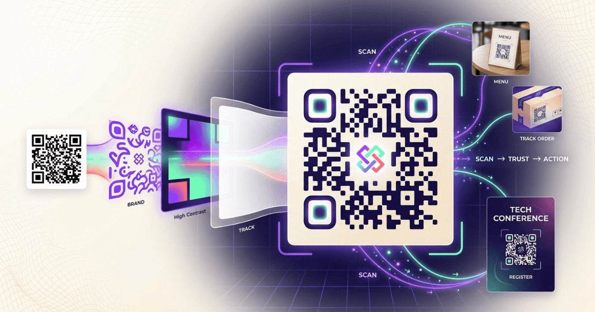
Color is where most branded QR codes design mistakes start. Low contrast looks stylish on screen, but it often fails in real use.
Use a dark code on a light background whenever possible. Black on white is still the safest choice. Dark navy, deep green, and charcoal can work too.
Avoid light pastels for the code itself. Also avoid reversed codes unless you have tested them under poor lighting.
Contrast matters even more on glossy menus, storefront signs, and packaging. For print use, the WCAG 2.2 contrast guidance is a useful design benchmark, even though QR codes are not text. The rule is simple: if a human eye struggles to separate the code from the background, a camera will too.
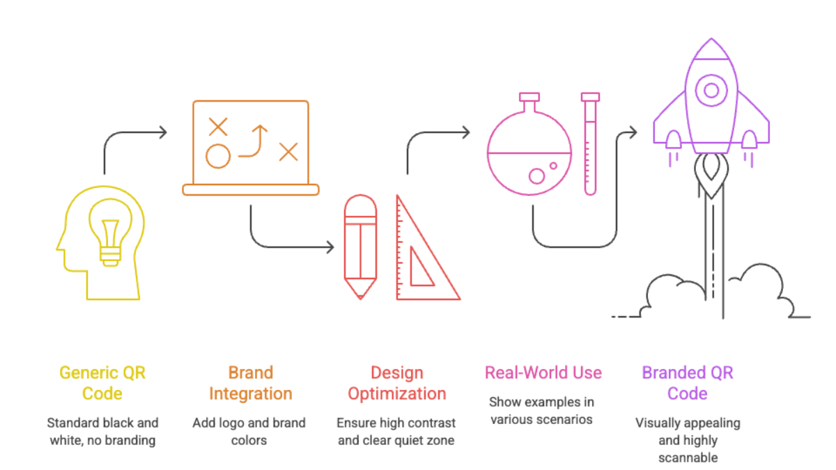
How to add logos and images without breaking the code
A logo can improve trust when it is small, centered, and well tested. Keep it inside the safe middle area, and leave the corners untouched.
Do not cover too much of the data area. In practice, a modest logo often works better than a large badge that looks impressive in a mockup.
Use simple artwork. Thin lines, tiny text, and busy gradients often blur into noise when printed or compressed.
If your brand needs a stronger visual system, test the logo version against a plain version side by side. In many campaigns, the plain version scans better and still looks premium when paired with strong typography and color.
Testing your branded QR codes before launch
Testing is not optional. It is the only way to know whether your branded QR codes design works in real conditions.
Use a short checklist before every launch:
- Scan the code on iPhone and Android.
- Test it from the expected distance.
- Check it in bright light and low light.
- Print it at the final size.
- Verify the destination loads fast on mobile.
For faster campaign setup, keep the destination itself clean and mobile-first. If you use dynamic links, the page can change later without reprinting the code. That is one reason teams compare options in Static vs Dynamic QR Codes: Which Should You Choose? before launching.
A practical test I have seen work well is the “three-second scan test.” If a teammate cannot scan the code within three seconds from a normal viewing distance, the design is too aggressive.
Case studies: what good branded QR codes look like in practice
The strongest examples usually share the same traits: clear contrast, minimal clutter, and a useful reward after the scan.
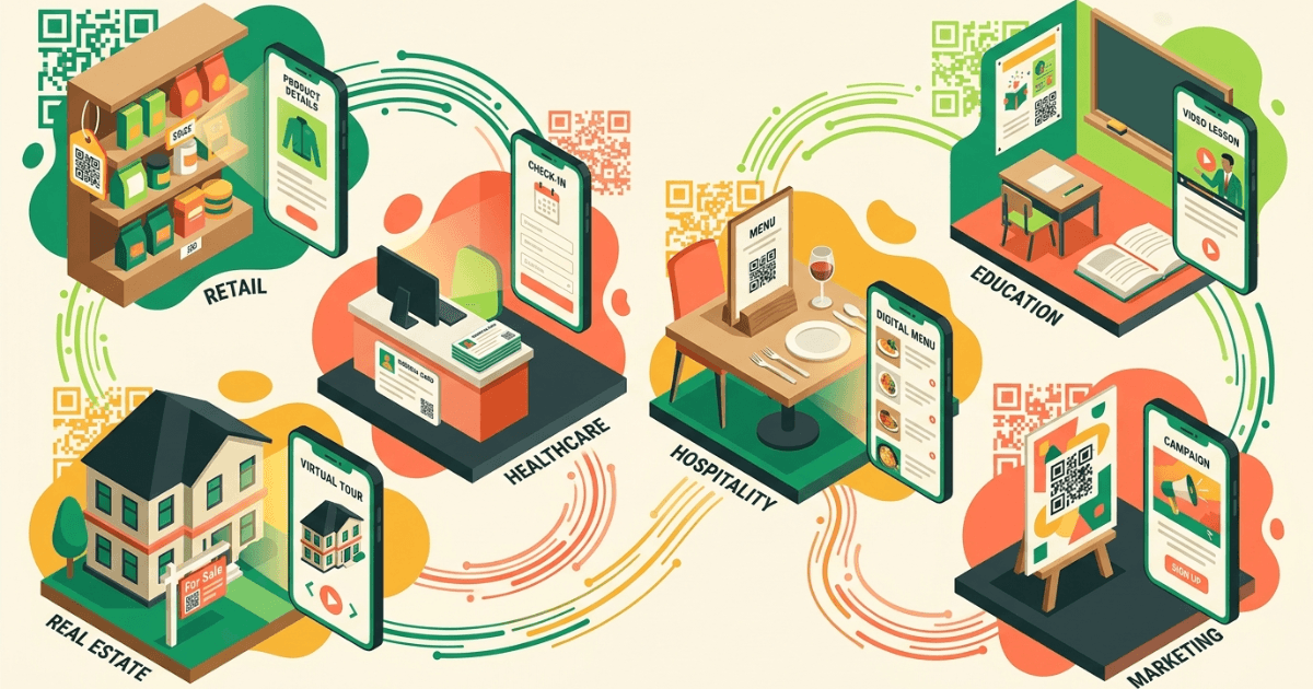
In cafes and restaurants, a branded code on the table can point to a menu, reorder page, or review link. The best versions use simple brand colors and a logo that does not crowd the pattern.
In ecommerce, QR codes on packaging work best when they offer a post-purchase action. That might be setup help, a reorder flow, or a loyalty signup. The code should feel like service, not decoration.
For influencers, a branded code can bridge offline and social touchpoints. Put it on event materials, media kits, or product inserts, then send people to one clear action.
For a deeper look at measurable campaign design, Tracking Every Scan is the best companion piece, and Commenda is relevant when you want a broader product story around customer-facing workflows.
Branded QR codes design checklist
- Start with a high-contrast base.
- Keep the quiet zone intact.
- Use logos sparingly.
- Match the QR style to the brand system.
- Test on real devices before publishing.
- Track scans after launch and adjust.
If you remember one thing, remember this: branded QR codes design should support the scan, not compete with it. Branding works when it removes friction, builds trust, and leads to a fast next step.
Frequently Asked Questions